Elementry School Website, redesign
PROJECT OVERVIEW
A school website is one of the key points of communication between the school, teachers, students, and parents. While direct communication and the school’s internal systems remain essential, the website provides a shared space where members of the school community can access important information, stay updated on current events, and learn more about what is happening within the school.
The website serves a wide range of purposes. Parents can use it to find information about upcoming events, school trips, student activities, cafeteria menus, teachers, and the latest school news and photo galleries. Students can use it to discover competitions, extracurricular activities, trips, and other opportunities available to them, as well as quickly access the school’s electronic journal. Teachers may use the website not only as a source of information but also as a platform for publishing announcements, news, photographs, and other content related to school activities.
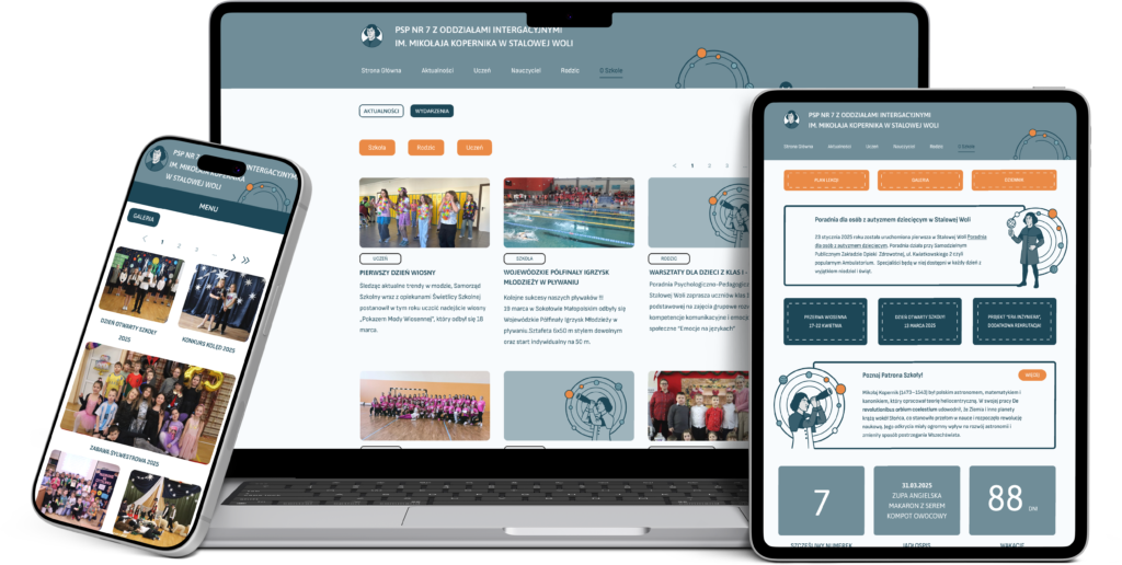
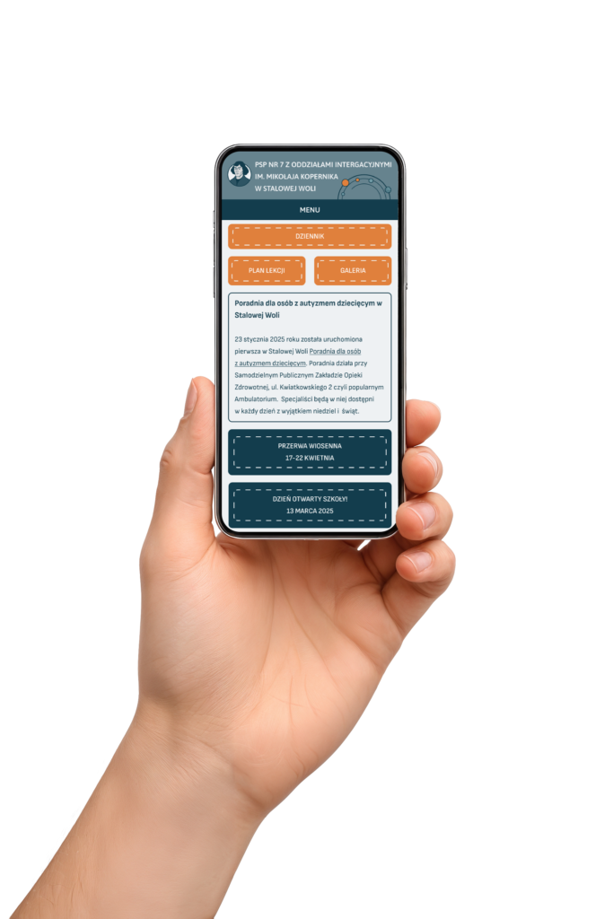
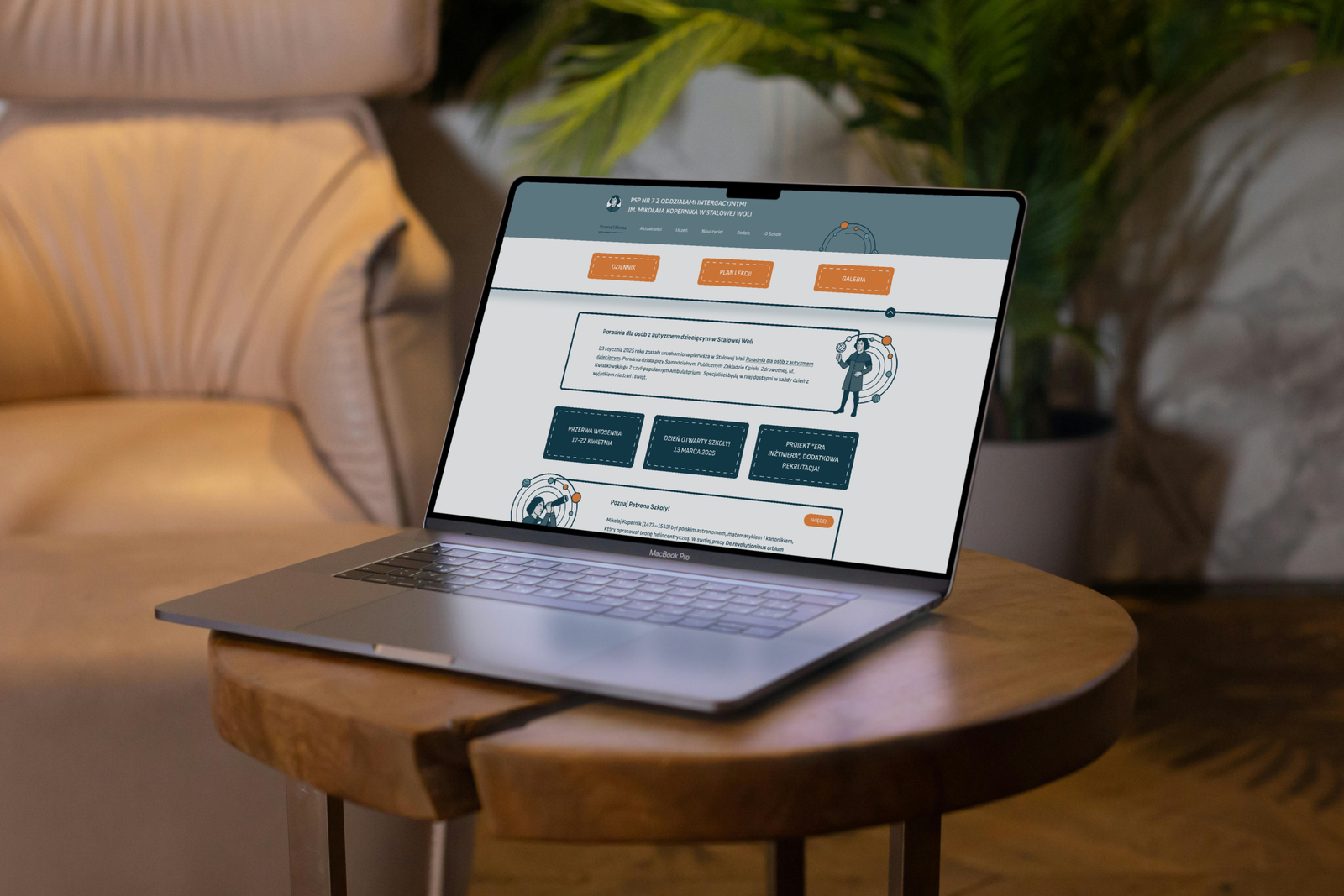
The project focuses on redesigning the existing elementary school website and rethinking its structure, navigation, visual language, and overall user experience. The goal is not simply to give the website a more updated appearance, but to create a clearer digital environment in which every member of the school community can quickly find the information they need.
THE CHALLENGE
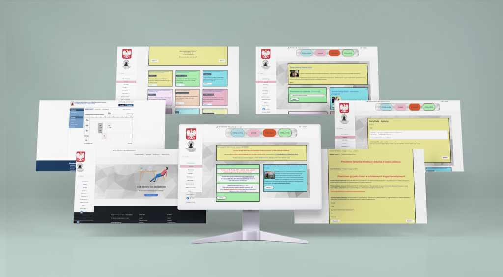
The existing elementary school website is based on one of the templates used by Polish schools. Although this type of template provides all of the basic functionality required by a school website, its structure and visual language feel outdated and are not particularly intuitive for modern users. The website is heavily cluttered with information, making it difficult to determine which content is important and where specific information can be found. Some sections are difficult to navigate, while others contain pages or elements that no longer function correctly. Information is sometimes presented without a clear hierarchy, and elements that should be visually or functionally connected can feel disconnected from one another.
The challenge was therefore not limited to redesigning the visual appearance of the website. It required reconsidering the information architecture, navigation, user flows, content hierarchy, and interface, while ensuring that the final experience remained appropriate for three very different groups of users: teachers, parents, and students.
GOAL
The primary goal of the redesign was to transform the existing website into a clear, accessible, and engaging digital space for the entire school community. The redesign aims to simplify the website’s information architecture and navigation and reduce visual clutter and establish a clearer content hierarchy. Ultimately, the redesign should make the website feel less like a collection of information placed into a pre-existing template and more like a coherent digital environment designed around the actual needs of its users.
DESIGN PROCESS

RESEARCH
The research phase focused primarily on examining websites of elementary schools in Poland. The purpose was to understand how school websites are commonly structured, which patterns appear repeatedly, and where existing solutions create problems for users. A large number of Polish school websites follow very similar structures and rely on the same or closely related templates. These templates often prioritize fitting a large amount of information onto a single website rather than creating a clear and intuitive hierarchy. As a result, many websites share similar usability problems, even when their individual content differs. A smaller number of schools have developed their own visual identities and custom website designs. However, having a custom design does not necessarily solve the underlying usability issues. Some of the independently designed websites still struggle with inconsistent scaling, unclear relationships between elements, excessive content density, and navigation that does not always reflect the way users expect to find information.
The research therefore showed that the problem is not simply that school websites look outdated. A more fundamental issue is that their structure and content organization are often not designed around the different tasks users come to the website to complete.
KEY QUESTIONS
How can the website be uncluttered without removing the large amount of information that a school needs to communicate?
How can the website provide a positive experience for teachers, parents, and students at the same time?
How can the redesign make finding information faster and more intuitive?
FINDINGS
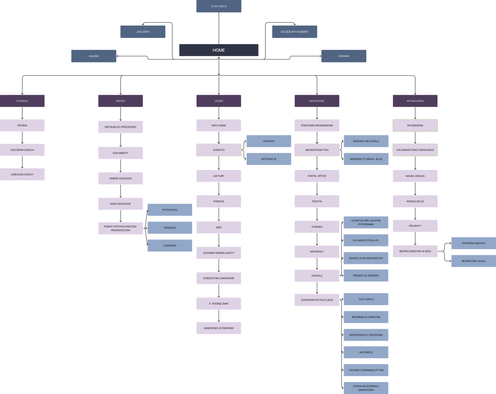
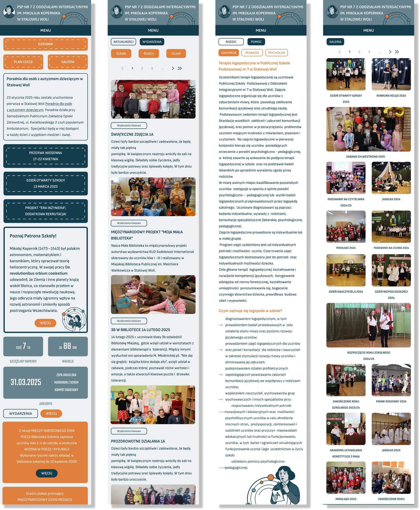
The website does not need less content, but it needs a clearer way of presenting it. News, announcements, events, documents, menus, photographs, and useful links should be grouped into clear categories and prioritized so that important information is immediately visible without making the page feel crowded.
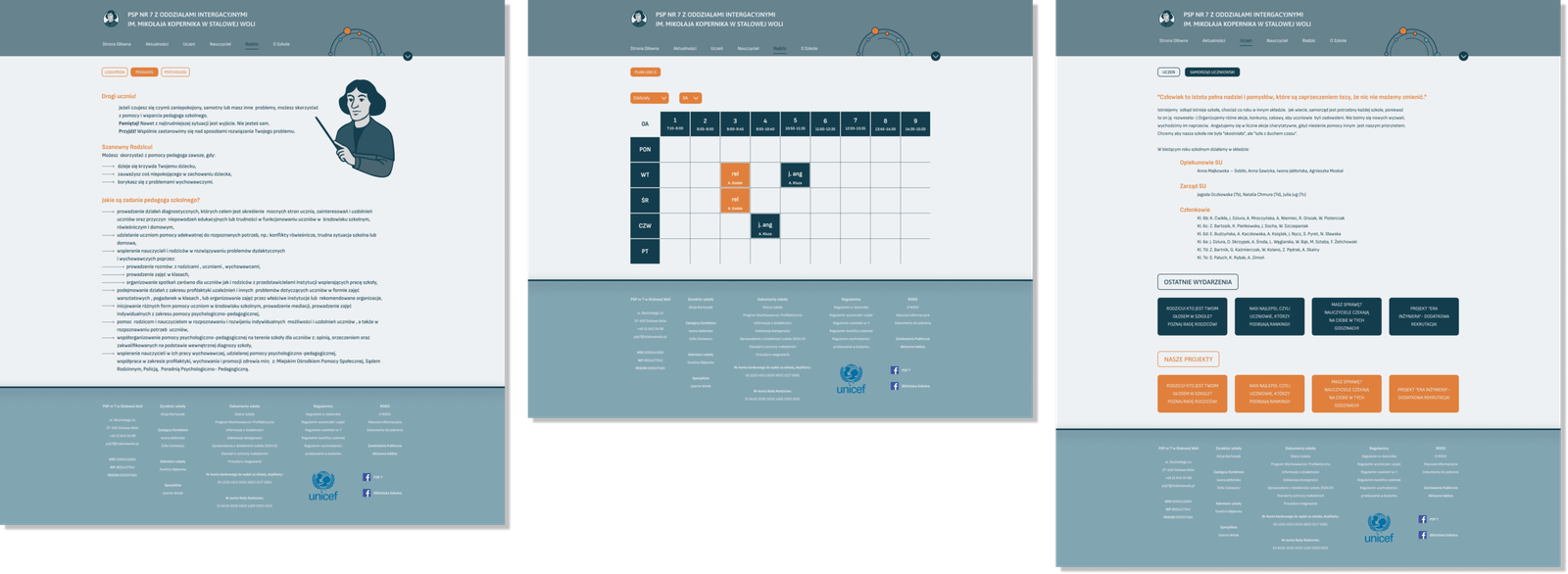
The website should support the different needs of parents, students, and teachers within one consistent structure. Parents may need quick access to announcements, menus, and school information, while students may look for competitions, trips, activities, or the electronic journal. Teachers need efficient access to both information and content-related functions. These different needs should be reflected in the navigation without creating separate or disconnected experiences.
Information should also be placed where users naturally expect to find it. Instead of organizing content according to the school’s internal structure, the navigation should follow common user tasks and recognizable categories. Clear labels, consistent navigation, and stronger visual hierarchy can help users quickly locate announcements, upcoming events, documents, and frequently used resources.
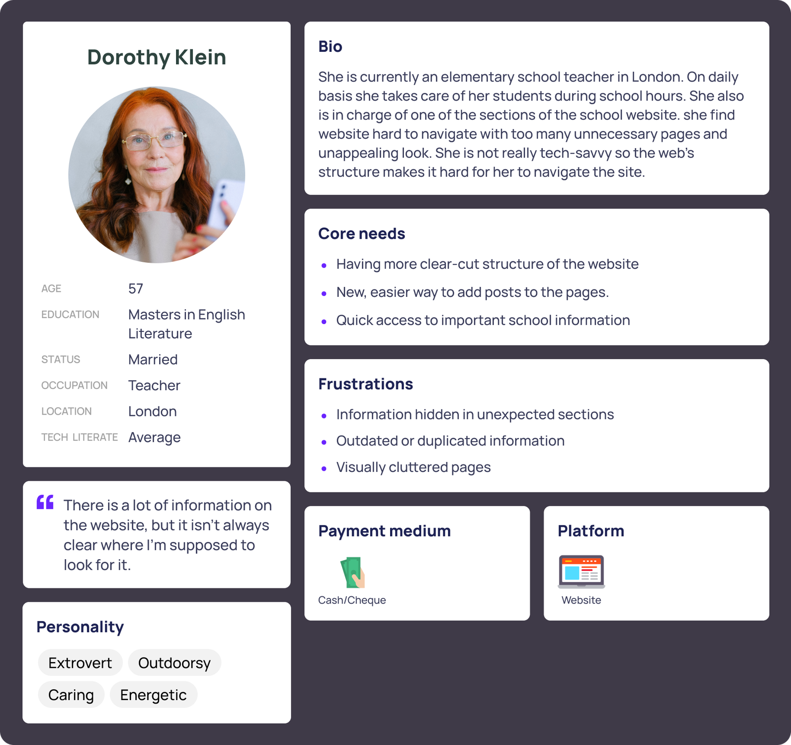
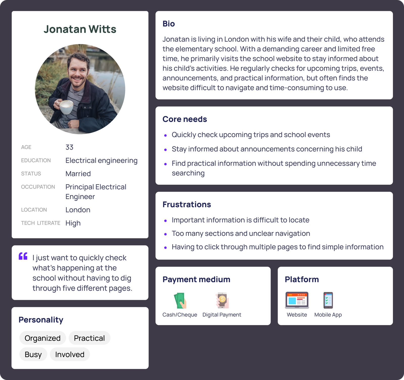
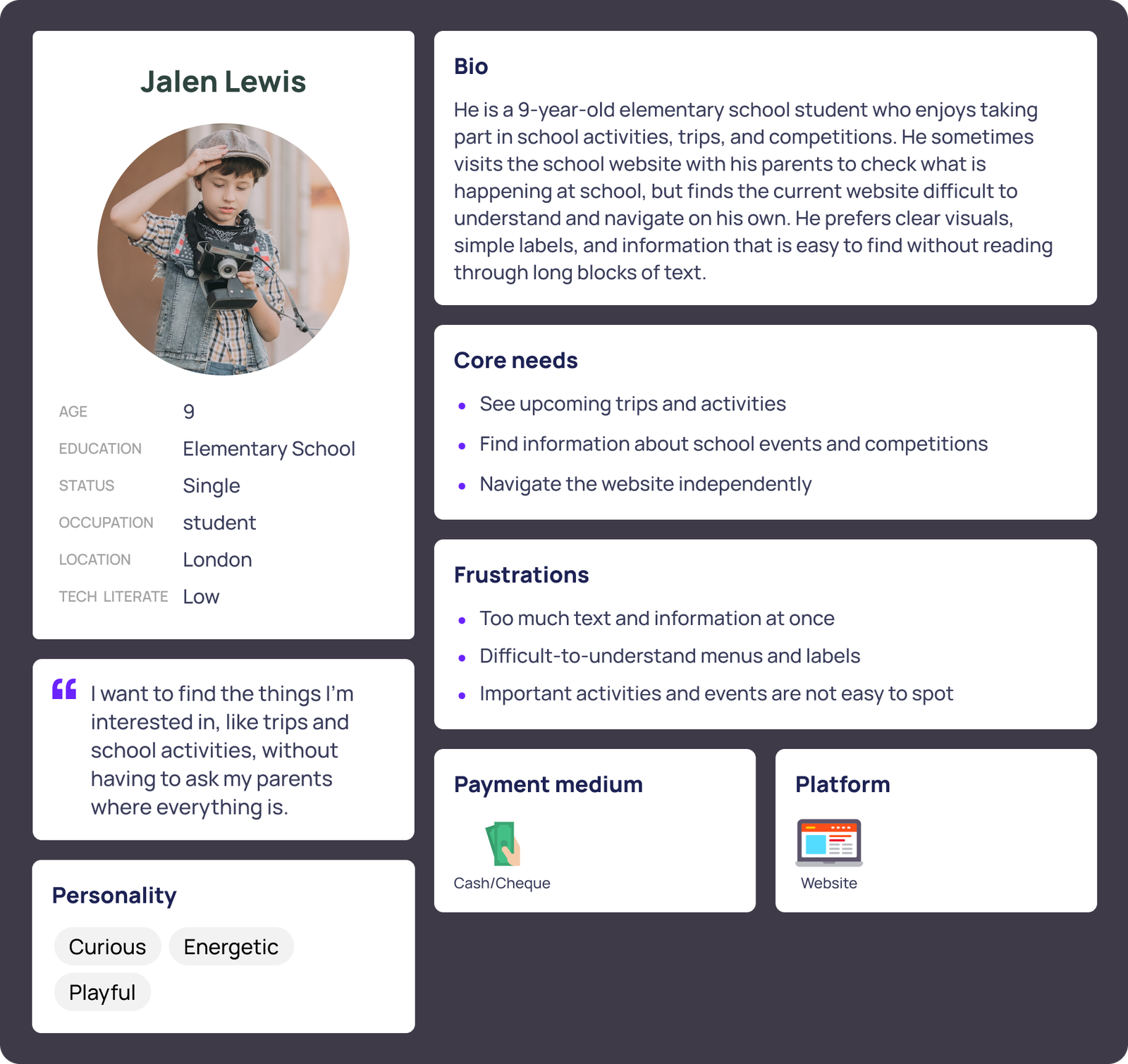
USER PERSONAS
INSIGHTS
The three personas revealed that teachers, parents, and students have different goals but share the same frustration: important information is difficult to find.
Different priorities: Teachers need to access and publish information, parents look for practical updates such as trips and announcements, while students explore activities, competitions, and events.
Clear and accessible information: Users often visit with a specific goal, so important content should be clearly categorized, easy to recognize, and accessible without navigating through unrelated sections.
Simple navigation for everyone: The website needs to work for both children and adults. Clear labels, recognizable visual cues, and predictable navigation can make the experience easier for all users.
Frequently used content should be easy to reach: Announcements, events, trips, activities, and the electronic journal should have clear, consistent locations.
Content management affects everyone: Making it easier for teachers to update the website can help keep information current and improve the experience for parents and students.
Key insight: The website should provide one clear structure that supports different user goals, organizing information around what users want to accomplish rather than the school’s internal organization.
USER FLOW
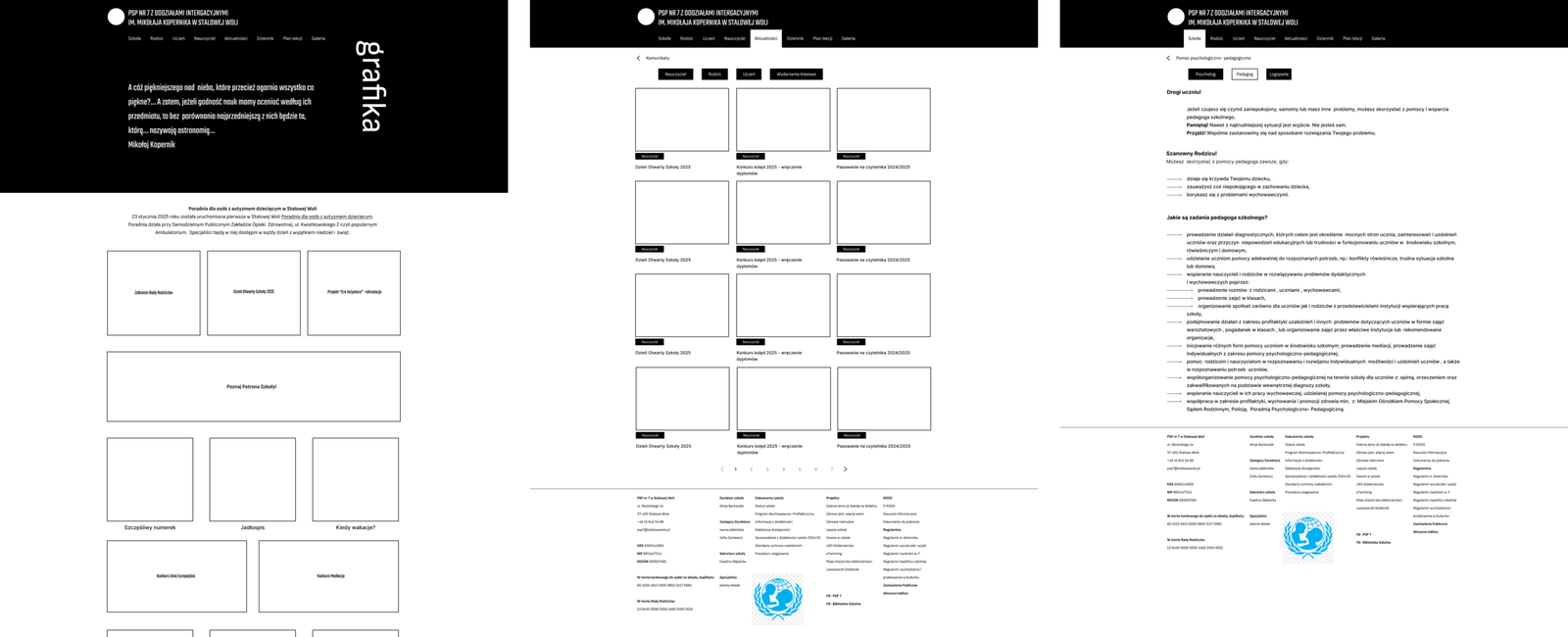
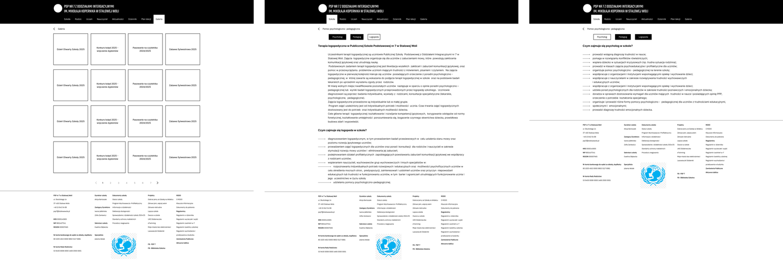
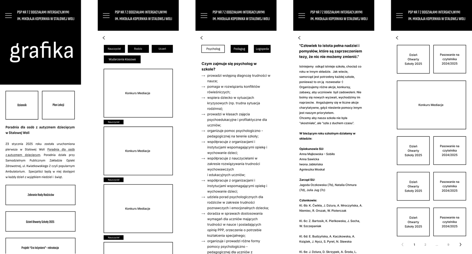
LO-FI
BRANDING
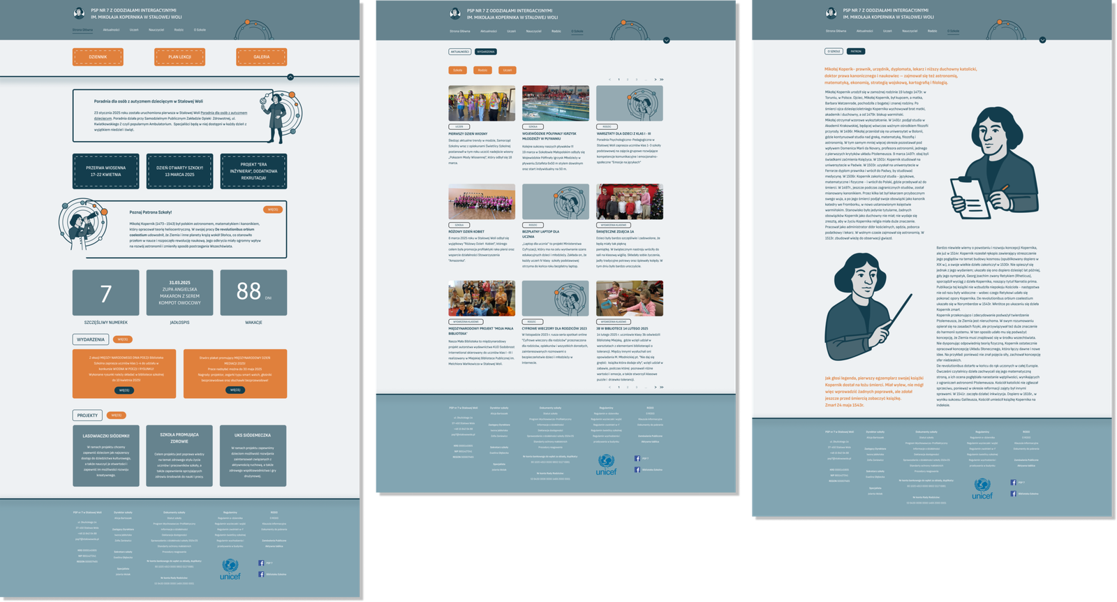
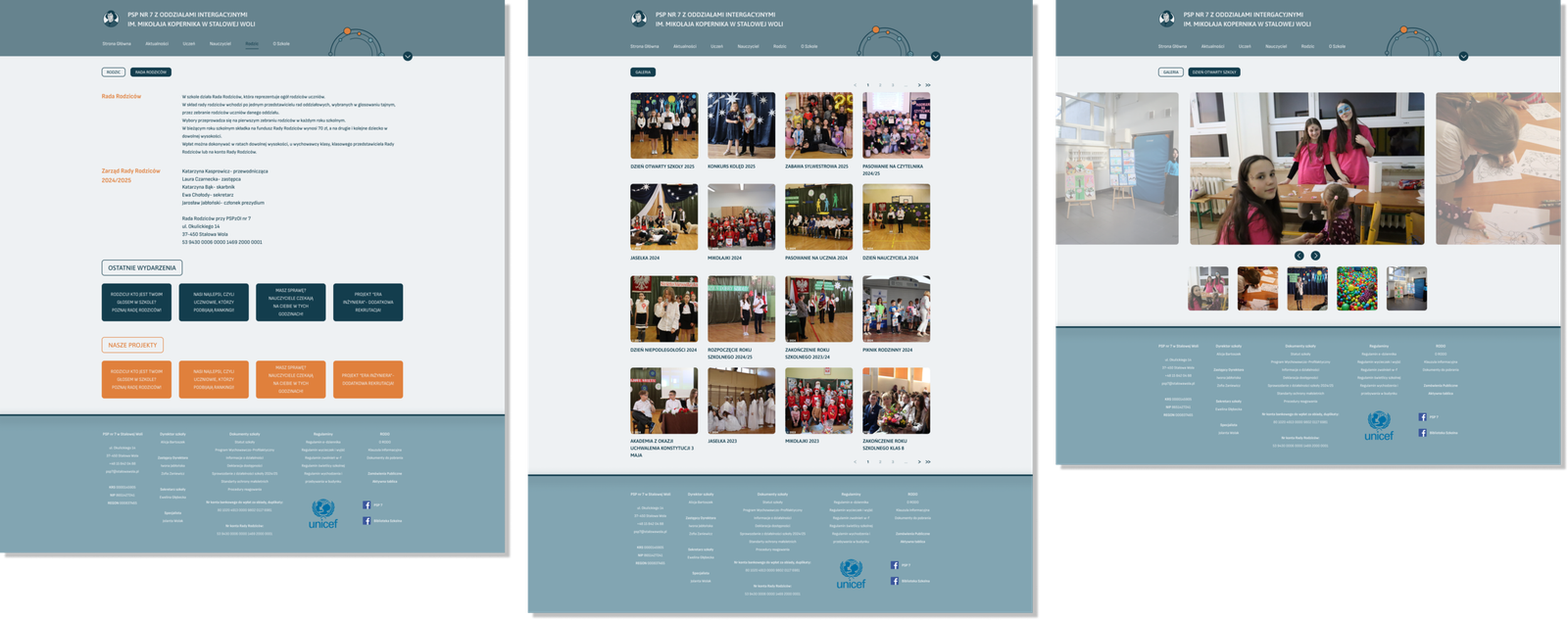
For the visual identity, I would build the concept around Nicolaus Copernicus, the school’s patron. This creates a natural connection between the institution and the theme of astronomy, exploration, discovery, and curiosity.
Rather than treating astronomy as a purely decorative theme, it can become a visual metaphor for the way students learn and explore the world. The website can use elements inspired by stars, planets, orbits, constellations, and celestial maps to create a recognizable visual system. These elements can also support the information architecture — for example, using orbital or constellation-inspired connections as a subtle way of representing relationships between different sections of the website.
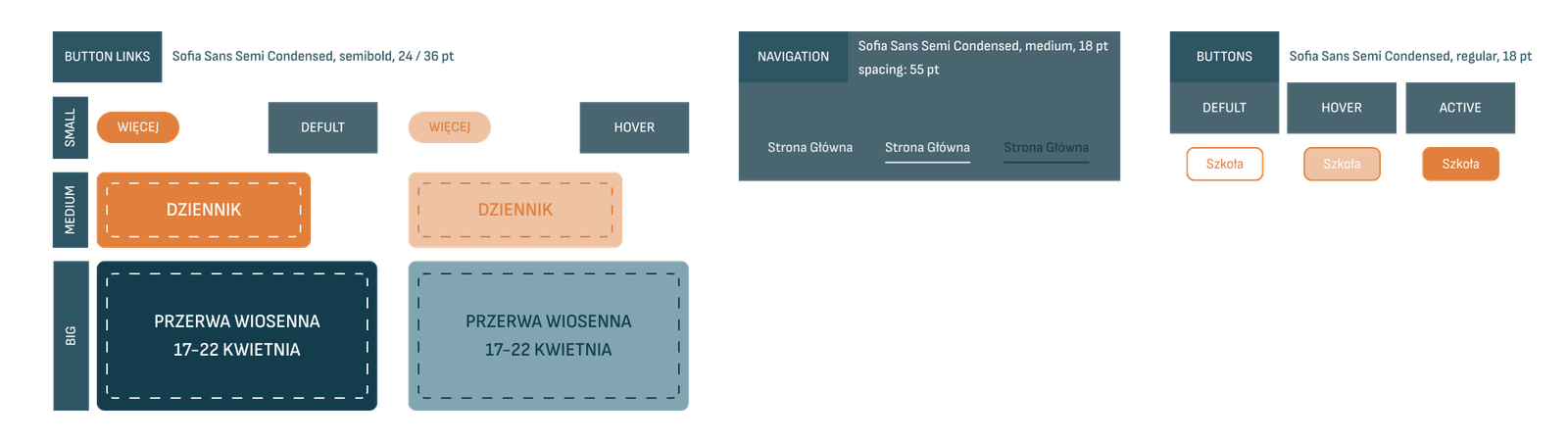
The visual direction should remain modern and flexible rather than becoming overly literal or looking like a children’s science website. A restrained astronomical motif, combined with a contemporary type system, friendly shapes, and an accessible color palette, can make the website feel distinctive while still being appropriate for teachers and parents.
The concept also connects particularly well with the idea of education: just as Copernicus encouraged people to look at the world differently, the redesigned website can present the school as a place where students are encouraged to explore, discover, and expand their perspective.
This gives the redesign a visual identity that is not only based on the school’s patron, but also communicates the values the school represents — curiosity, discovery, learning, and looking beyond what is immediately familiar.
HI-FI
CLOSING
The redesign of the school website is not simply a visual refresh. The existing website demonstrates how easily a large amount of necessary information can become difficult to navigate when it is placed within an outdated structure without a clear hierarchy. This project approaches the redesign from the perspective of the people who actually use the website. By considering teachers, parents, and students as three distinct but connected user groups, the new design aims to make information easier to find, everyday tasks more straightforward, and communication between the school and its community more effective.
The visual identity built around Nicolaus Copernicus and the idea of exploration extends this approach beyond usability. Astronomy becomes a metaphor for learning, curiosity, and discovering something new. The final concept brings together information architecture, UX, UI, and visual identity to create a website that feels more organized, approachable, and purposeful. Instead of treating the website as a digital noticeboard filled with information, the redesign treats it as an active part of the school community, a place where students can discover opportunities, parents can stay informed, and teachers can communicate effectively.