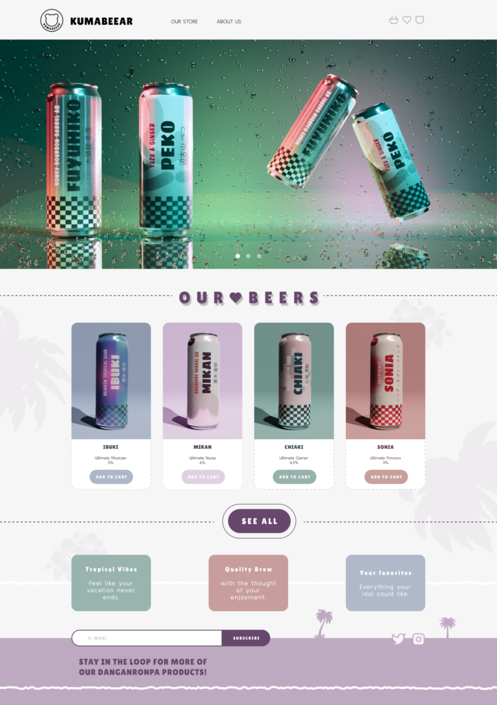
KumaBeear, brand, packaging & website
Your go-to beer brand for a tropical escape. Inspired by the personalities, colours and iconic details of your favourite Danganronpa 2: Goodbye Despair characters, each flavour brings its own unique identity and a refreshing twist.
Perfect for warm summer evenings, hanging out with friends, or simply when you want to feel like you’re somewhere a little more tropical. With colourful flavours, character-inspired designs and a refreshing island vibe, this brand brings a small taste of paradise to every can.
PROJECT OVERVIEW
Beer is one of those beverages that often becomes part of our everyday rituals. It’s something we reach for to relax after work, celebrate the end of a long week, or share with friends during a weekend gathering. While many people simply pick a familiar beer from a supermarket shelf, others look for something more personal, a product that reflects their interests, introduces them to something new, or simply makes an ordinary experience more fun.
This project explores the idea of combining craft beer with fandom culture by creating a beer brand inspired by a japanese game Danganronpa 2: Goodbye Despair. The concept takes the playful and distinctive identity of the game and translates it into a physical product, packaging, and digital experience.
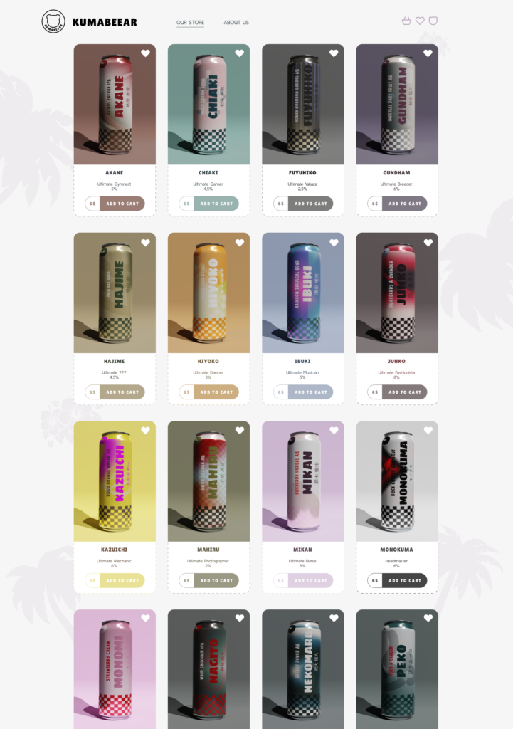
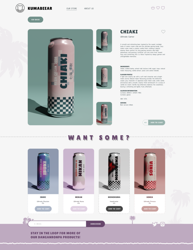
Rather than treating the beer as simply a piece of merchandise, the project approaches it as a product that could exist independently on the market. The branding aims to communicate a sense of fun, relaxation, discovery, and tropical escapism while subtly referencing the visual world of Danganronpa. The website extends this identity into a desktop environment, creating a space where users can explore the beers, discover their flavors, and gradually uncover the inspiration behind the brand.
THE CHALLENGE
The main challenge was to create a beer brand inspired by Danganronpa that could appeal to both people familiar with the game and people encountering it for the first time.
For Danganronpa fans, the branding needed to include recognizable elements that would make the connection to the game feel intentional and rewarding. However, relying too heavily on characters, logos, or direct references could make the product feel like merchandise rather than a believable beer brand.
At the same time, someone who has never played Danganronpa should still be able to look at the packaging and website and see an appealing, contemporary beer with an interesting visual identity and flavors worth trying.
The challenge was therefore to find a balance between fandom and accessibility through a brand where the connection to Danganronpa adds personality without becoming the only reason to be interested in the product.
GOAL
The UX and branding objective is to create a contemporary beer brand that can appeal to people with different interests and levels of familiarity with Danganronpa. The project aims to introduce users to new and unconventional beer flavors while simultaneously creating an entry point into the world of Danganronpa. For existing fans, the product provides a new way to interact with a familiar fictional world. For newcomers, the visual identity and product experience can spark enough curiosity to encourage them to discover the game itself.
Ultimately, the goal is to create a cohesive experience across packaging, branding, marketing, and digital design, demonstrating how an existing fictional world can be translated into a modern consumer product without making the result inaccessible to people outside of the original fandom.
DESIGN PROCESS

RESEARCH
As part of the research process, I explored a range of websites for beer, wine, and other beverage brands to understand how they present their products online. One of the main observations was that many vine websites still rely on a very traditional visual approach. They often feel dated and overloaded with text.
Rather than making the products feel more premium, these elements can sometimes make the websites feel visually heavy and difficult to navigate. Many brands also follow similar layouts and presentation styles, making it difficult for individual products to stand out.
This became particularly noticeable when comparing beverage websites with other industries, such as fashion and lifestyle brands. These industries have increasingly embraced cleaner layouts, stronger visual hierarchies, softer interfaces, animation, and more experimental ways of presenting products.
This difference created an opportunity to approach the beverage category from a more contemporary perspective.
Instead of following the established visual language commonly associated with beer and wine, I wanted to create an experience that felt lighter, cleaner, more playful, and more visually engaging. The goal was to give the product enough personality to stand out while still making the website easy and enjoyable to explore.
KEY QUESTIONS
The research and design process were guided by three main questions:
Who are the primary users of the product?
How can we reach both Danganronpa fans and people unfamiliar with the series?
What can we do to make the product interesting enough to encourage discovery?
FINDINGS
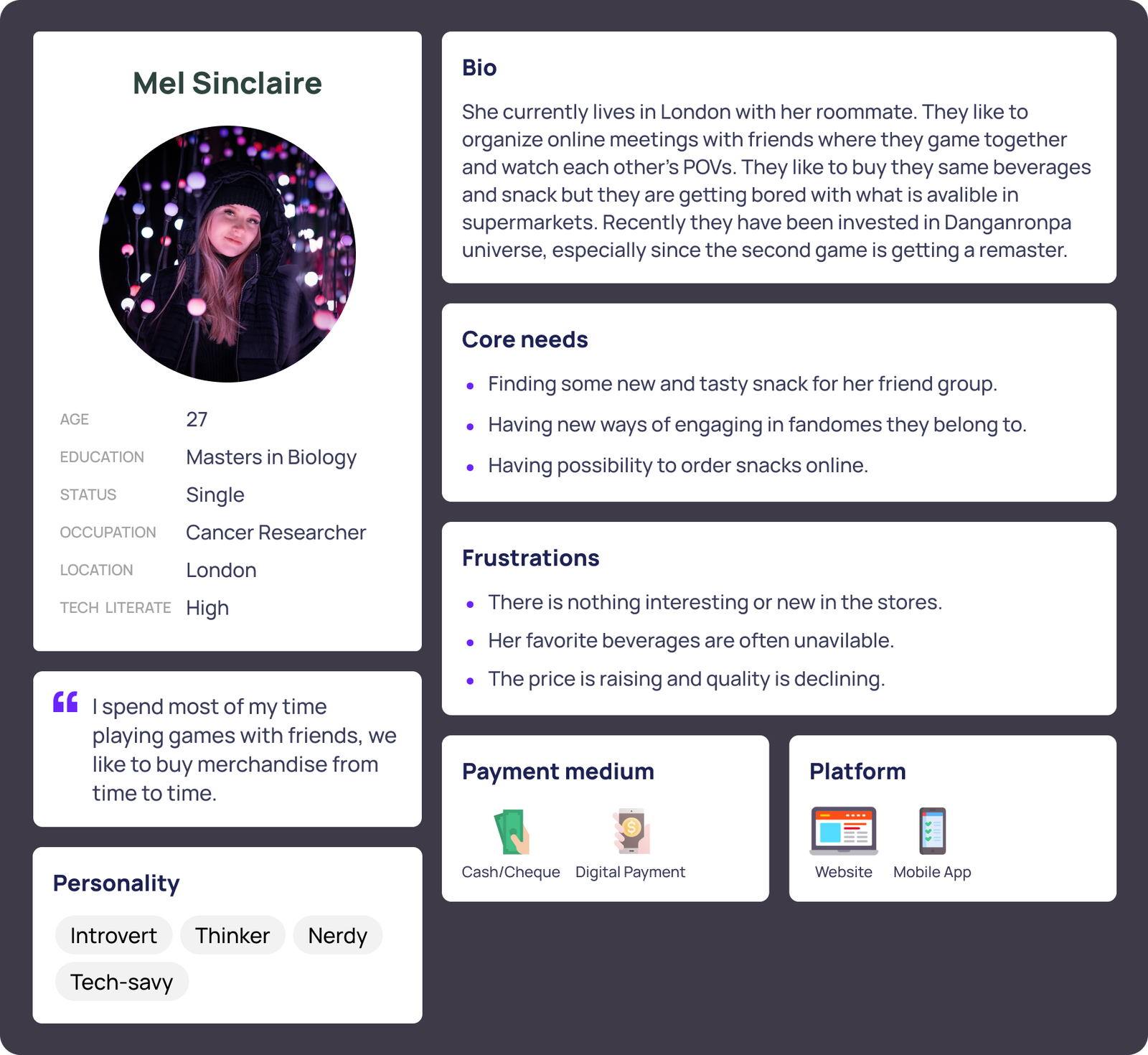
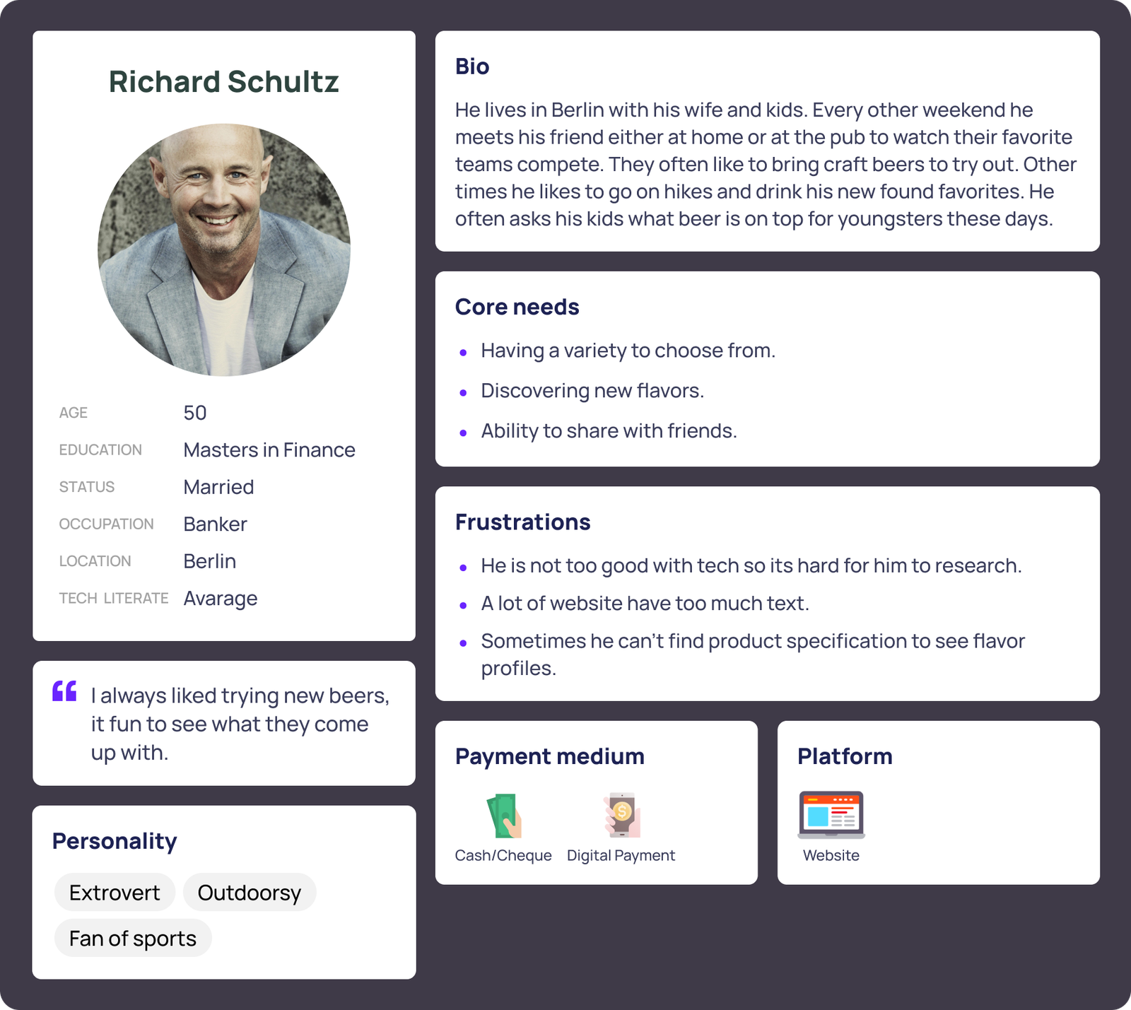
The research identified two main user groups with different reasons for being interested in the product. The first is Danganronpa fans, players who already have an emotional connection to the game and could enjoy incorporating the beer into gaming sessions, watch parties, or gatherings with friends. For them, the connection to Danganronpa is an important part of the product’s appeal. The second group consists of people interested in craft beer who may have no prior knowledge of Danganronpa. They are more likely to be attracted by the packaging, unusual flavors, and overall visual identity rather than the connection to the game.
For fans, recognizable references and details can create a sense of familiarity and make the product feel connected to the game. For newcomers, however, these references should not be necessary to understand or appreciate the product.
This led to the decision to use subtle references rather than directly reproducing the game’s visual identity. The branding can reward users who recognize the source material while remaining visually accessible to everyone else.
The website can then build on this curiosity by allowing users to explore the beers, discover their flavors, and gradually uncover the Danganronpa references behind them. This creates an opportunity for the product to work in both directions. Fans can discover a new beer through something they already love, while new customers can discover Danganronpa through a product that initially caught their attention for completely different reasons.
USER PERSONAS
INSIGHTS
Creating the two personas revealed that the product needs to appeal to users for very different reasons. While both personas are interested in the beer, their motivations, expectations, and levels of familiarity with Danganronpa are significantly different.
Familiarity should not be a requirement
The brand cannot assume that users already know Danganronpa. For fans, recognizable references can make the product feel more personal and rewarding, but for newcomers, those same references need to function as visual details rather than barriers to understanding the product. This means the website should communicate the beer itself first while allowing the Danganronpa connection to be discovered naturally.
The product needs to create curiosity
Both personas are motivated by discovery, but in different ways. The fan is interested in discovering a new way to experience something they already enjoy, while the newcomer is interested in discovering an unusual beer. This suggests that the branding should create curiosity rather than explain everything immediately. Flavor descriptions, packaging details, character references, and visual storytelling can encourage users to explore further.
Flavor can act as a bridge between audiences
The beer cannot rely entirely on the fandom aspect to sell the product. Interesting and approachable flavor combinations give people unfamiliar with Danganronpa an independent reason to engage with it. At the same time, flavors can become another layer of connection for fans, allowing each beer to have its own personality and relationship to the game. The strongest opportunity lies between a conventional craft beer brand and traditional game merchandise. If the branding becomes too focused on Danganronpa, it risks alienating people unfamiliar with the series. If the references become too subtle, fans may not recognize the connection.
This creates different entry points into the same experience: a user can arrive because they love the game, because they are interested in craft beer, or simply because the visual identity caught their attention. Brand needs to work on two levels at once.
For fans, it should feel familiar, playful, and rewarding. For newcomers, it should feel like an interesting and approachable craft beer brand that gives them a reason to discover something unfamiliar.
LO-FI
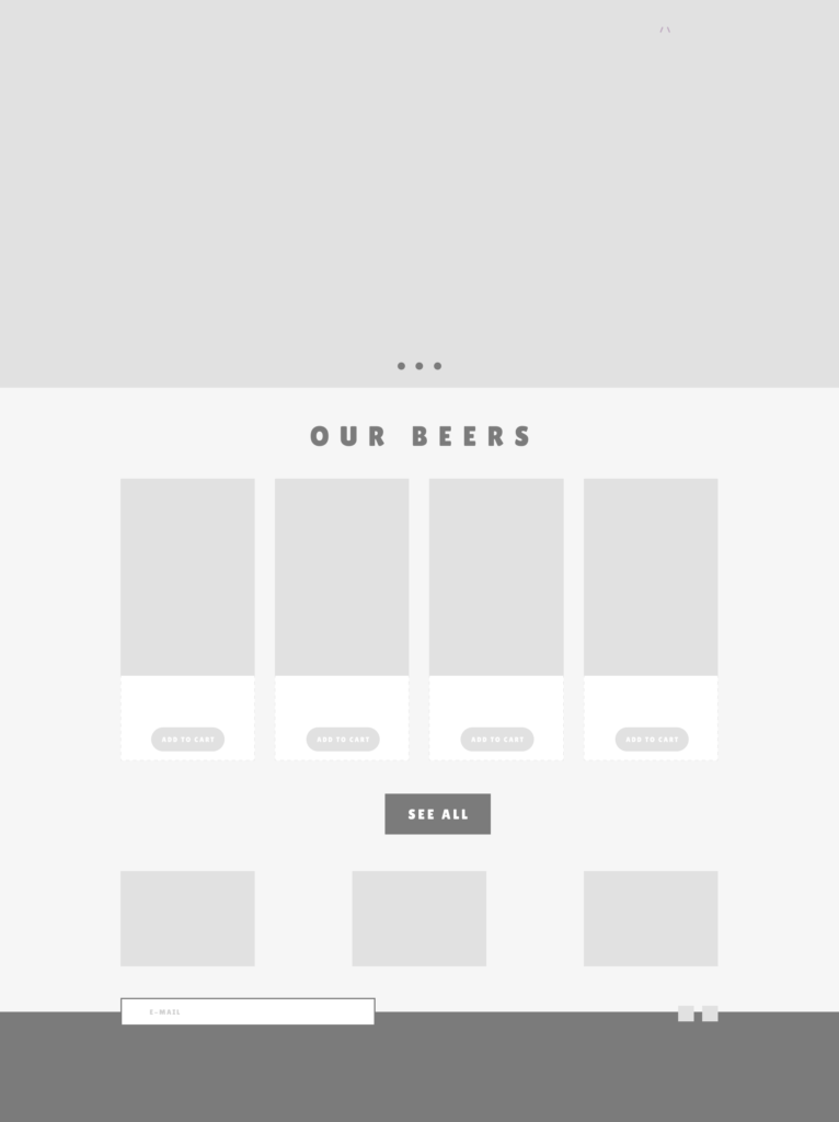

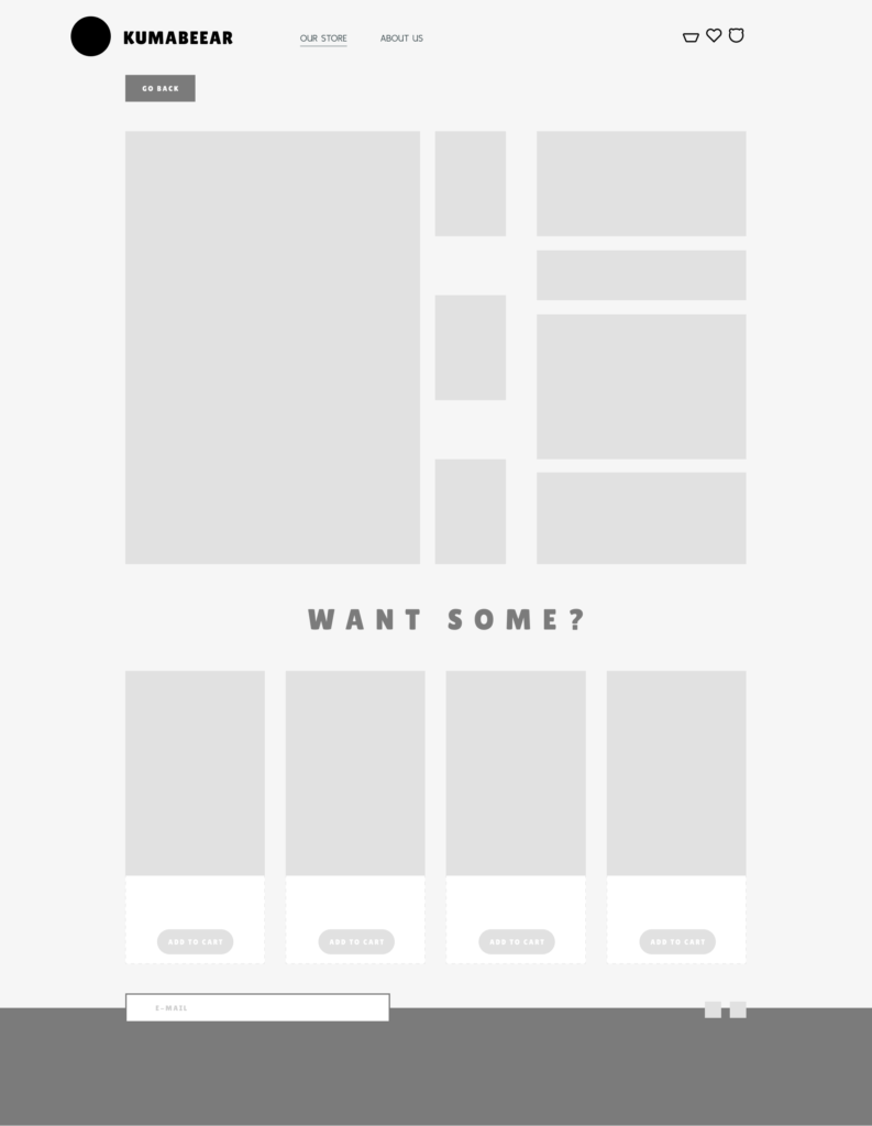
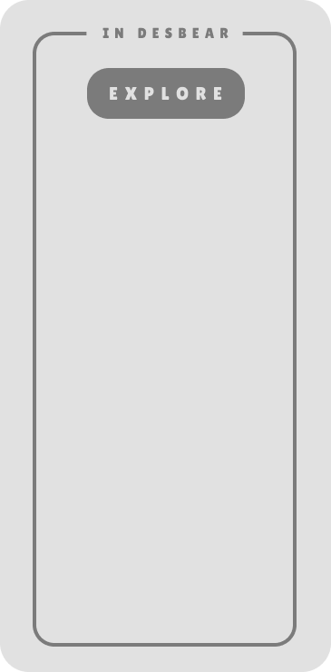

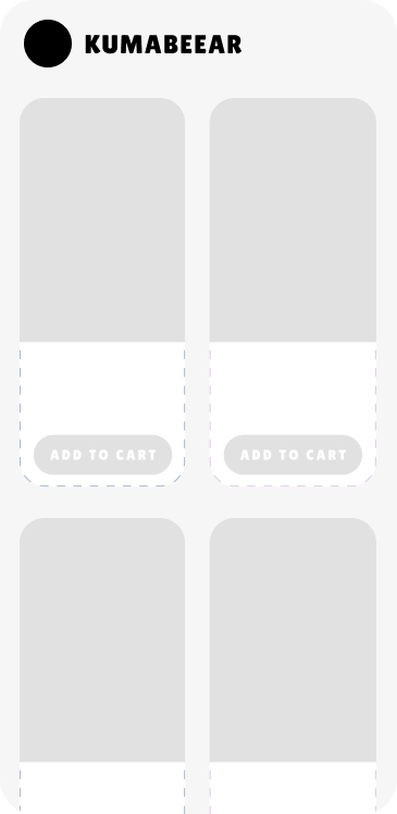

BRANDING
The visual identity draws primarily from Danganronpa 2: Goodbye Despair, taking inspiration from its tropical island setting, character designs, and distinctive visual language. Rather than directly reproducing the game’s highly recognizable and stylized aesthetic, I wanted to reinterpret these elements through the visual language of a beverage brand. The tropical setting became the foundation for a softer sense of escapism, using subtle references to the beach, ocean, and island environment without turning the product into conventional game merchandise.
The color palette is built around soft purples and muted grays, supported by brighter accent colors drawn from the characters and visual world of the game. This creates a more restrained and versatile identity while still allowing individual elements to feel connected to the original source material.
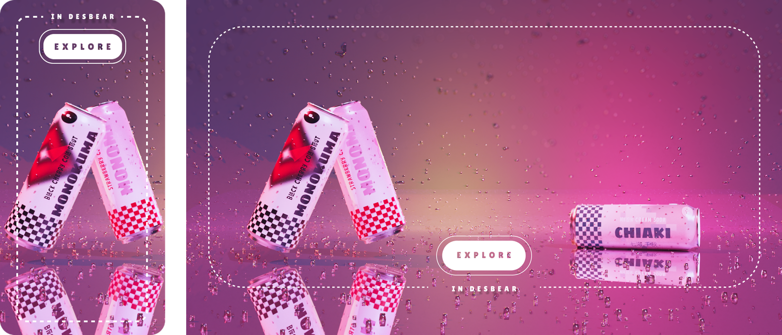
The branding also incorporates selected imagery and compositions inspired by the cover of the second game, alongside visual cues taken from its characters. These references are integrated into the packaging and wider identity rather than simply being placed onto an otherwise generic beer label. This allows the connection to Danganronpa to become part of the brand’s visual language itself.
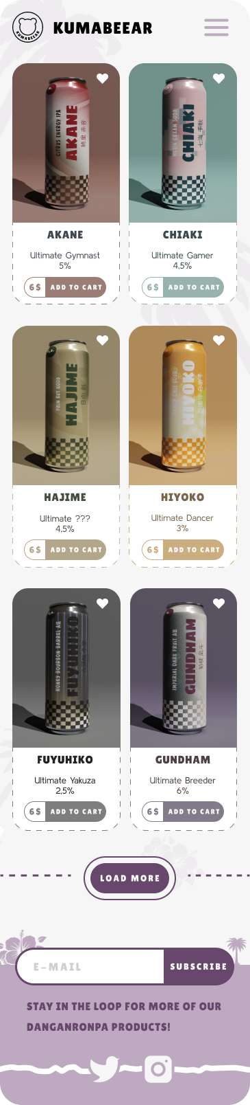
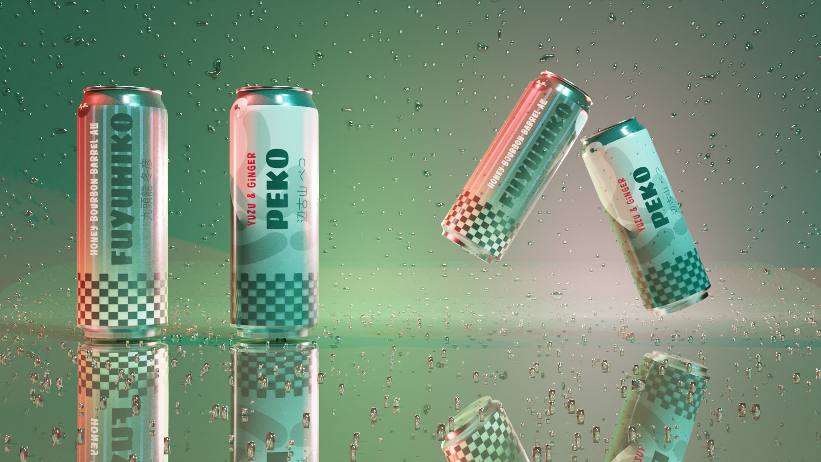
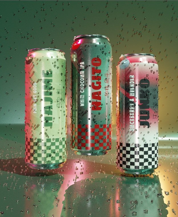
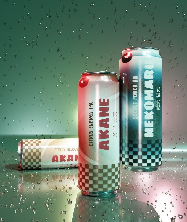
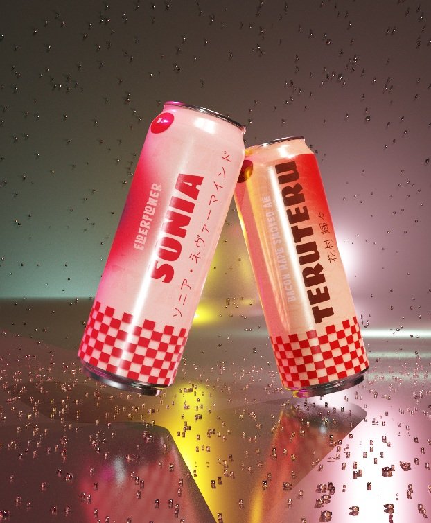
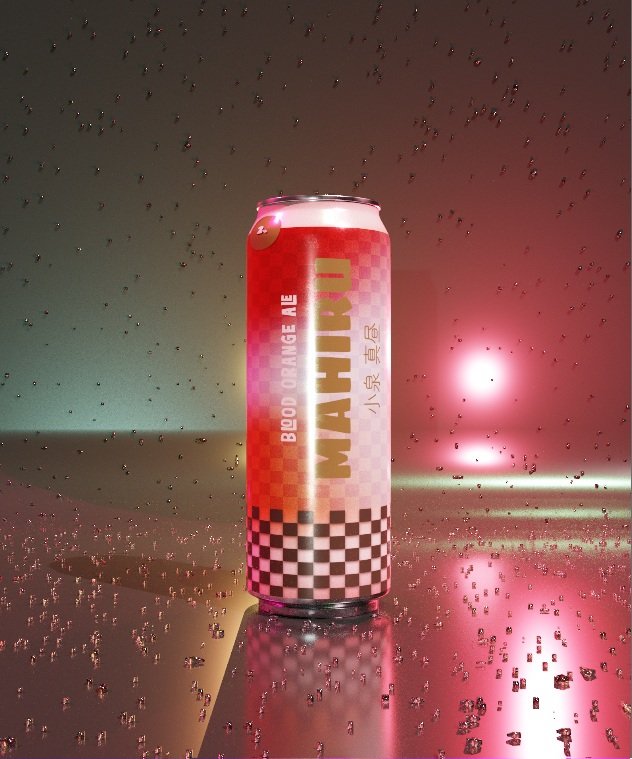
Each beer flavor is associated with a different character, with the can designs drawing from selected aspects of their appearance, personality, Ultimate talent, and associated symbols. Rather than directly depicting the characters, these elements are translated into colors, shapes, motifs, and graphic details that reflect their individual identities. Each flavor therefore has its own visual personality while remaining part of the same overall branding system. The references are intentionally subtle rather than literal, allowing fans to recognize connections to the characters while keeping the designs accessible to people unfamiliar with the game.
HI-FI